Blog
Another Reason to See QUANTUM OF SOLACE

Over the weekend, I got the chance to see the new Bond flick, Quantum of Solace.
As a big fan of Casino Royale, I’m pleased to say it met, if not surpassed my expectations, and was an overall kick-ass flick. Granted, this may be because I’ve never really been a Bond fan proper, so I can deal with the tweaks presented by this reboot, but that’s another conversation entirely.
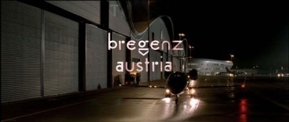
What I am posting about, is one of the big surprises of the movie. While it’s full of hardnosed, pulse pounding action, it’s also full of wonderfully elegant typography. Yes. Typography.
Literally, every time Bond goes to a new locale, we get a nice title screen for that area…in a lovely locale specific font.
The fine folks over at Goldenfiddle have catalogged all of these title cards for your perusal. Go check them out!
Original Post: goldenfiddle | Spy Type
Thursday November 20, 2008