Blog
Site Admin Stuff: IE Ain't Broke No' Mo'!
Considering it looks like I’m up for About page, make it look good for the new visitors.
Ergo, I fixed a long running issue on here.
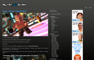
Typically, you view the site on….oh, any web browser ever, and it would look like this:

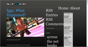
However, when you would visit it on Internet Explorer (the web designer’s enemy), it’d get all screwy and look like this:

Well, now thanks to my good buddy, co-host, wingman, and all around swell cat, Ross Nover, that’s been fixed.
So no longer do you IE users get stuck with a ghetto Blast-O-Rama! Enjoy!
Wednesday September 16, 2009