Blog
An Extended Look At The Lost Art Of Movie Posters
Note: In the interest of growing my “personal brand” here at BoR, I’m going to be investing in some more lengthy thought pieces on the site, which will be joined with the “Cynicism” tag. This is the first of such posts, and presumably/hopefully won’t be the last. Let me know what you think in the comments.
As you’ve probably noticed over time here at Blast-O-Rama, there is very little I enjoy more than a well crafted, beautifully executed movie poster.
However, it seems as the years have gone on, the focus is less on giving the audience a taste of what’s to come, and more a generic collage of actors in costume, which makes you hope that the movie turns out well.
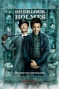
Case in point…this latest poster for Sherlock Holmes. By no means offensive visually, what does it tell you about the film? Aside from Downey’s devious smirk, it’s another prime example of names and faces selling the picture, versus the poster giving an audience a glimpse of what will hit the screen this Christmas. I’d figure with a director as unique as Guy Ritchie helming the flick, you’d want to put style at the forefront, but alas…
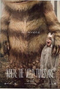
And that isn’t to say there aren’t risks being taken. Take a look at the Where The Wild Things Are poster above. Gritty, childlike…there’s a roughness to it which immediately pulls forward what Spike Jonze is attempting to do with the film. It’s a snapshot which leaves the viewer interested in the end product.
But I can’t shake the feeling that the marketing suits just want us to throw our $10 at something which has been seen before…which certainly explains the disturbing trend in repetitive poster designs and DVD covers.
What really bothers me about it though? It doesn’t need to be this way. Heck, you only need to look at the fantastic poster designs of the 50’s, 60’s and 70’s to know how much better it could be.
Luckily, amazing artists (many times alongside promotional events put on by independent movie houses) are still creating stunning posters for films. Effectively joining their art with existing art, these posters not only invoke the films they derive their inspiration from, but create a unique product that fans of the film and of art alike would want to hang on their wall.
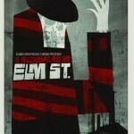
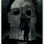
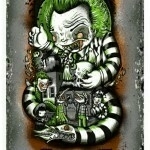
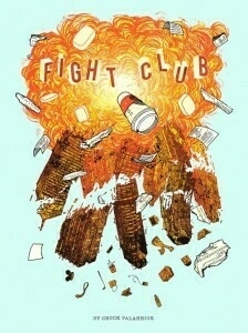
Take this Halloween triptych put together for the Horror movie series appearing at the Alamo Drafthouse in Austin, TX. (Shown above, click for larger images.), or this fantastic Fight Club poster (below), which is a design so strong they decided to make both prints and t-shirts of it.
I guess what I’m getting at is this…in an era where studios are claiming how much money they’re losing in different revenue streams, why don’t they look at a great way to build the brand of their projects, extend the art from not just what appears on the silver screen, but what instead we can have framed and mounted on our walls. These limited edition posters can go for as much as $30-$50 a piece, and are undoubtedly worth every penny.
I’m tired of seeing floating heads promote what I’m going to be seeing next Friday. Let art beget art, and let it be good.
Tuesday October 27, 2009
