Blog
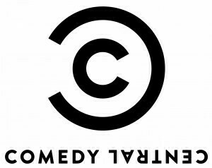
Comedy Central Refreshes For 2011, With A New Logo

Hours upon hours of stand up specials, Kids in the Hall marathons, Late Night with Conan O’Brien and Saturday Night Live reruns, South Park and The Daily Show, it helped me become the vaguely witty, nerdy comedy dork that I am today.
And in 2011, they’re looking to freshen things up with a new style and a new logo.
Now, I’ve never really been a big fan of their current logo, in fact, I just don’t understand it (what does a city have to do with comedy), but as I haven’t really liked any of their branding since they stopped with the Penn Jillette voiceovers, anything new could work.
The logo is going to be the new face of Comedy Central moving forward, and while I cannot say that I really like it, it looks really great in their big 2011 video, embedded below.
What say you, fellow comedy and design geeks? Is the new Comedy Central up your alley, or do you just not give a crap? Sound off!
Edit - 3:15PM Another look at the new logo. I think it’s still kinda “off”, but classy at the same time…

Source:Â Deadline.com.
Thursday December 9, 2010