Blog
Me vs. The New 52, Week Two: Action Comics, Animal Man, Batgirl, Detective Comics, Swamp Thing & More!
Hello and welcome to Week Two of Me vs. The New 52, one man’s ridiculous quest to read and review ALL 52 of DC Comics new #1’s throughout the month of September.
Last week started simple with one major book, Justice League #1, but this week brings a whopping 13Â issues into the mix. Â In turn, I am scaling down my review process to three simple ideas - The Pros, The Cons, and what I’d argue is most important for the industry - Would I Continue Reading It?
It’s a big week, with many blockbuster books (Action Comics and Detective Comics) launching alongside some dark horse candidates (Animal Man, Swamp Thing).  Either way, it’s a lot of reading and reviewing to do, so lets get to it.
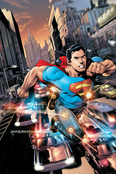
Action Comics #1 Written by Grant Morrison, Art By Rags Morales
Pros: The artwork has a great pulpy feel, Morales, despite depicting this younger Superman in a modern time, somehow gives the book a feel that it should have a serial style voiceover. Â Morrison writes a great Lex Luthor, steadfast and strong in his distaste for the “creature” known as Superman. Â There are some great action beats in the book, ending in a train sequence on par with that seen in Spider-Man 2. Â Also,I enjoy how the younger Superman’s powers harken back to only being able to leap buildings in a single bound, not full on fly.
Cons: I’m not sold on the younger, brasher Superman.  I get the idea is for us to see him as he was coming up, but it feels a little too Smallville for me.  I know from reading Supergods that Morrison believes Superman to be a perfect superhero for the common man, but he feels a little too bohemian. And did we really need to steal so many character beats from Spider-Man? I thought Superman’s whole appeal was that he was without flaw, not dealing with flaws along the way.
Would I Continue Reading It?: Absolutely. Despite my complaints, they’re ultimately issues that ring true to my personal favorite superhero of all time (Spidey), and honestly, I’d want to read whatever Morrison has planned moving forward. So yeah, check this one out.
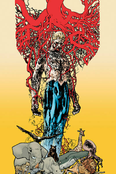
Animal Man #1 Written by Jeff Lemire, Art by Travel Foreman
Pros: The art, while somewhat oblique at times, can be absolutely stunning - especially turning the books showcase dream sequence. Â The writing is also phenominal. Â Anyone who says that married superheroes are boring, as just pages into this, I was already very into the back and forth between Animal Man and his wife. Â The last page twist is a very strong one, and while some may roll their eyes at starting a comic with a lengthy text piece, this does a great job of setting up who Animal Man is, and was.
Cons: Honestly, there aren’t too many. This book already feels like it’s from a different universe of anything else, and might even fit in better in the Vertigo line, even with the family dynamics shown.  I guess my lone complaint would be that of the costume, it’s kinda weak, and the new A symbol looks a little too much like the Assassin’s Creed logo.
Would I Continue Reading It?: Absolutely, Lemire has me frothing at the mouth for the trade now. BRING IT ON!
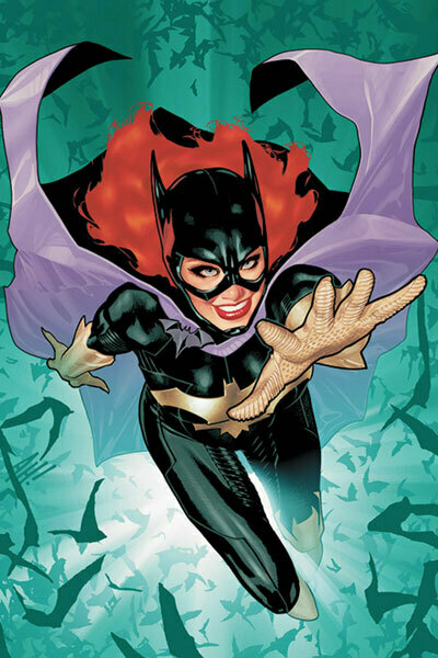
Batgirl #1 Written by Gail Simone, Art by Ardian Syaf
Pros: Simone’s writing is mostly solid, making Barbara a relatable character for the new reader. Her internal monologue drives the story well, and is fun and simple to read. Â The new villain, “The Mirror” has a really great costume design, and I like the idea of Barbara having a crazy activist roommate now that she’s able bodied again. Â I also like the fact that they’re not ignoring the fact that she was Oracle, which leads to…
Cons: Seriously, we couldn’t address the elephant in the room in issue 1? Barbara Gordon has been wheelchair bound in comics for years, and now that she’s not, we’re not going to knock that issue out in a few pages? I get it, we want it to be intriguing, but really, it feels kind of cheap. Â Ardian Syaf is a decent enough artist (think Jim Lee-lite), but does he have something weird about drawing faces? Seriously, look through here and see how many panels have characters hidden in shadow, shot from behind or otherwise have their faces obscured, it’s very surreal.
Would I Continue Reading It?: Neither a bad book or a great one, I feel like missing out on the new version of Batgirl wouldn’t really break anyone’s heart. No thanks.
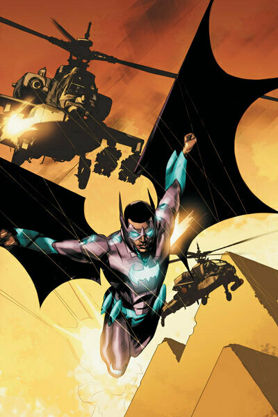
Batwing #1 Written by Judd Winick, Art by Ben OliverÂ
Pros: Ben Oliver’s art is absolutely fantastic, this might just be the most visually striking of all the books released thus far in the New 52. Â The story is somewhat interesting (murdered superheroes anyone?), and the book does end with a unique cliffhanger, in so much as it’s a “how is Winnick going to write his way out of this one?” situation. Â I also really like the idea of a Batman type character who works for the police by day.
Cons: Â It’s Batman for Africa, I get it. Â But Winnick doesn’t stop reminding us that for the entire length of the book. Batman this, Africa that. Â It’s hamfisted throughout the book. Â Can’t we let Batwing get established on his own? Â Or does he have to remain in Batman’s shadow all book?
Would I Continue Reading It?: Perhaps. Â The setup wasn’t the most intriguing of the books I’ve read thus far, but Oliver’s art could go a long way. Â We just need to politely remove Batman from the book and hope that Judd Winnick won’t go for the obvious bit and work another character with HIV/AIDS into his work because this is set in Africa. (Seriously, Judd. Stop it. It’s losing it’s effect.)
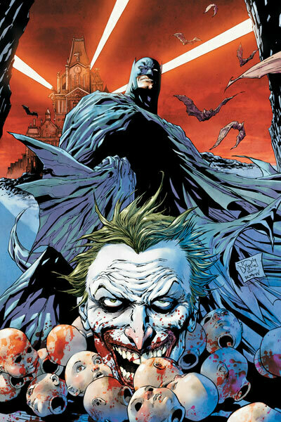
Detective Comics #1 Written by Tony S. Daniel, Art by Ryan Winn
Pros: Wow, this is exactly what a prototypical Batman book should be. Gotham is gloomy, cool gadgets are on display, Joker is written well and creepy, you get a nice Batman/Gordon moment, it’s fantastic! The art is really strong (I like the look of the cowl when Winn is drawing it), and Batman’s new armor-y costume looks less bad here, more like what was seen in the Arkham Asylum game. Â Also, that last page is a great cliffhanger and is COMPLETELY disturbing.
Cons: Not many, honestly.  There are some lines of dialogue that are a little too bravado filled for the bats, and naming his robotic infiltration device the “Ro-Bat” is a little too on the nose.  Also, having both Batman and Superman’s books have major action sequences on trains just reeks of poor work by the editors.
Would I Continue Reading It?: Hell and yes, this feels like an awesome, gritty, action packed Batbook. Count me in.
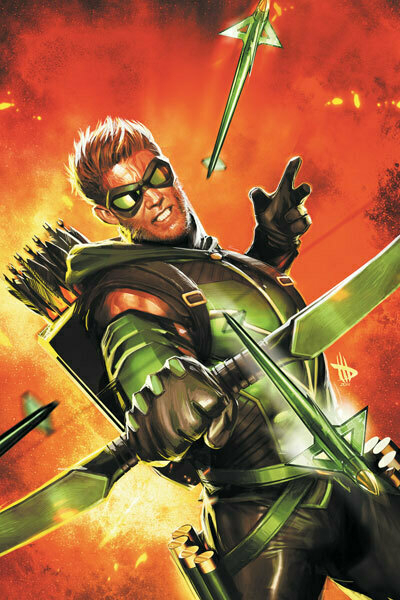
Green Arrow #1 Written by JT Krul, Art by Dan JurgensÂ
Pros: I feel like the Oliver Queen purists are going to really dislike this younger, less radical take on Green Arrow, but I’m not gonna front - the idea of a Steve Jobs like guy traveling the world and battling bad guys because he wants to…that sounds like a heck of a hook.  I know they hint towards his “real reasons” for becoming a hero, but I don’t know, someone doing this level of good because they want to, and not out of some huge guilt is refreshing.  I could see myself really falling in love with the character.
Cons: However, Ollie’s story is kind of bland. Â The art is dull (has Jurgens changed anything since his Superman run in the 90s?), the scripting is non-descript, there isn’t a lot grabbing me, besides the basic crux of this new version of the character. It’s really a passible book.
Would I Continue Reading It?: Maybe in others hands. Â I really like the idea of the new Green Arrow, but the execution is yawn inducing. Â No thanks.
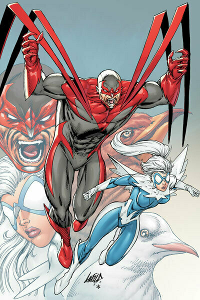
Hawk and Dove #1 Written by Sterling Gates, Art by Rob LiefeldÂ
Pro–wait, I should do it in this order.
Cons: The art is typical Liefeldian nonsense, the writing is over the top and silly. The book is completely ridiculous.
Pros: But perhaps that is the idea? Much how Transformers: Dark of the Moon somehow took an idea that should have sucked out loud and just upped the ante repeatedly to where you almost had to enjoy it, this book is full of 90’s tropes and silly ideas to where if I didn’t know any better, I’d think this book was trying to spoof and glorify Liefeld’s golden era. I mean, you have impossibly muscled heroes, zombie villains, weird family drama discussed through gritted teeth and non-ironic usage of “jerkwad”…if this is a joke, I get it.
Would I Continue Reading It?: At full price? No. But when the entire run hits the 50 cent bins, I could see myself having a great laugh at it.
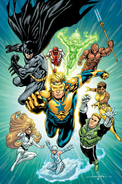
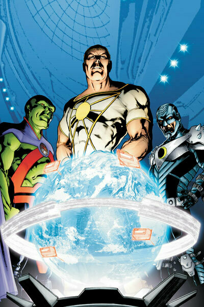
Justice League International #1 Written by Dan Jurgens, Art by Aaron Lopresti
Pros: Booster Gold is an absolute riot in this book, and the way he and Guy Gardner rub each other the wrong way should be absolutely fantastic moving forward. Â Jurgens writing does a great job of setting up each character and their individual dynamics, and we get to see exactly what the government would want in a superhero team. ALSO: THE HALL OF GODDAMN JUSTICE ! WOOO!
Cons: “Ignore them, they’re just a bunch of basement dwellers, who spend all day whinin' on the net. Not a single openminded one in the bunch.” “Ignore them? Never! It’s our job to prove them wrong!” Way to shoehorn in some fan bitching into the book, Dan. Took me RIGHT out of the world you were building, bravo. Â Aside from that, I thought this was a fun setup book. Â I do like the idea of the public being outraged at the government hiring heroes, as if that removes them from the public proper. Â It’s a unique idea, and I’d like to see where Jurgens takes it.
Would I Continue Reading It?: Sure, I’d give it a few more issues. It’s not my favorite book this week, but it was a fun, breezy read.
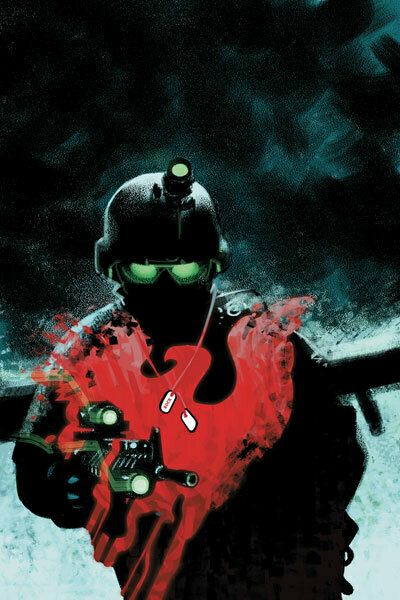
Men of War #1 Written by Ivan Brandon, Art by Tom Derenick
Pros: Clearly designed for the Call of Duty set, this revamp of the Sgt. Rock franchise is a solid read, with the juxtaposition of a strong military story with things more towards the superhero set.  The art is competent, the story is somewhat compelling.
Cons: But that doesn’t stop this from being a book decidedly not for me. If you’re really into military movies or other similar stories, you’d probably dig the hell out of this, but I couldn’t see myself reading it outside of this project. Sorry.
Would I Continue Reading It?: Eh, not so much.
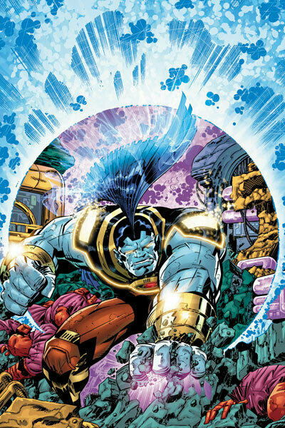
O.M.A.C. #1 Written and Drawn by Dan DiDio & Keith Giffen
Pros:Â Â This is a really weird, almost silly fever dream of a book. We’re mixing Kirby-esq sci-fi concepts with a Hulk like brute, a giant big brother figure and office humor? What the hell? Yet - I found myself reading it. Â Then again, given that the first story was titled Office Management Amidst Chaos, that should tell you that the book is meant to be silly. Oh, and I LOVE the silly nicknames on the credits page. Nice retro touch.
Cons: Almost too weird of a book. I don’t really know the audience for it, maybe throwback Kirby fans? I just know that I’m not it.
Would I Continue Reading It?: Doubtful. Considering the head of the company is handling this book, it’ll probably last longer than it should, otherwise, I’d guess this is the first casualty of the books presented so far. VERY VERY strange.
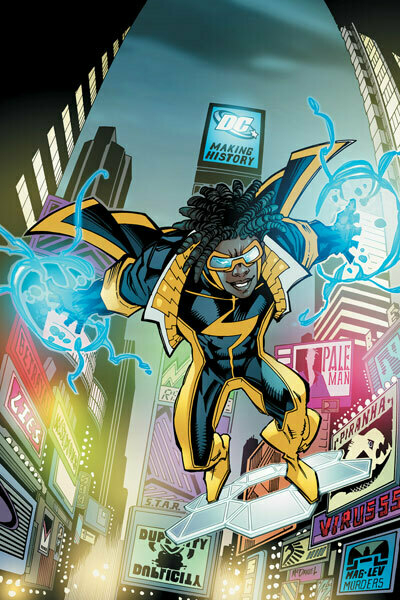
Static Shock #1 Written by Scott McDaniel & John Rozum, Art by Scott McDanielÂ
Pros: I know I made some claims to Action Comics being Spider-Man-esq earlier, but this REALLY is DC’s Spider-Man book.  But not in a bad way.  Having the super genius secret identity give way to the wisecracking hero is always a good choice and it’s done well here.  Also, is this the first time NYC was actually a part of the DCU? Like, I always thought DC had fake cities, not real ones.  Oh, and there’s a nice cameo for the longtime Milestone fans.
Cons: The art could stand to be nicer, it’s a bit too sketchy for me. Makes me wonder about the rumors of books being rushed to print for September. Â Aside from that, it’s really just a solid, breezy read.
Would I Continue Reading It?: Sure! Provided the writing stays as smile inducing, I could see myself reading it on the regular. Fun stuff, here.
Stormwatch #1 Written by Paul Cornell, Art by Miguel Sepulveda
Pros: I’m happy to see characters from Stormwatch and The Authority back in action, plus Martian Manhunter’s new costume is pretty nice, actually.
Cons: Just about everything else. The art is all weird and smudgy, the writing is a little too on the nose with being “in your face and hip” (HAY GUYS! YOUTUBE! PHOTOSHOPPING!), and it just feels like a book that is trying to be too cool for the room. Not terribly engaging, and given the pedigree of the books it’s derived from, a definite disappointment.
Would I Continue Reading It?: Nah.
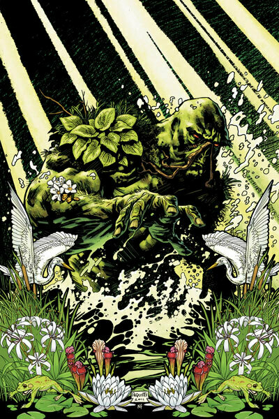
Swamp Thing #1 Written by Scott Snyder, Art by Yanick Paquette
Pros: Â Stunning art and solid writing cap off this weeks selections. Â Much like Animal Man, this is a book that feels like it’s coming from a different imprint, even with the Superman appearance. Â Dark, deep, mature and contemplative, this is definitely a standout book from the rest of what DC is printing in the New 52. Â Really enjoyed reading this one.
Cons: For the average comic reader, the storytelling could be seen as slow or oblique. Â Personally, I loved it. Â This is another book that delivered things that I wasn’t expecting, but the average fan could be turned off by what is delivered. Â This is definitely not another superhero book, for sure.
Would I Keep Reading This?: Absolutely. Color me very intrigued and very interested to see where this lands.
Coming next week…
Batman and Robin #1 Batwoman #1 Deathstroke #1 Demon Knights #1 Frankenstein, Agent of S.H.A.D.E. #1 Green Lantern #1 Grifter #1 Legion Lost #1 Mister Terrific #1 Red Lanterns #1 Resurrection Man #1 Suicide Squad #1 Superboy #1Yep, another 13 books - looking forward to Batwoman and Red Lanterns in the bunch, but we'll see what happens, could be some major surprises! See you next week!
Thursday September 8, 2011
