Blog
Me vs. The New 52, Week Three: Batman and Robin, Demon Knights, Green Lantern & More!
We roll on through September, and with 14 issues down, I continue through my journey into the new DC Universe - it’s week three of Me vs. The New 52. This week brings some flagship titles like Batman & Robin and Green Lantern, some interesting risks like Demon Knights, one of the most hated books (Suicide Squad) and even FRANKENSTEIN.  This should be a run week to plow through.
But what do I think? Lets find out.
Batman and Robin #1
Written by Peter J. Tomasi, Art by Patrick Gleason
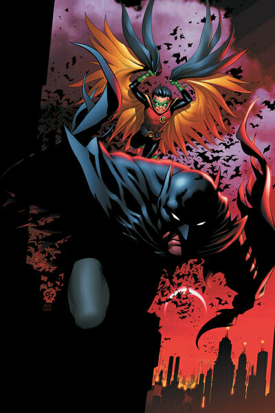
Pros: As the last time I read Batman (besides Detective Comics last week) was the first trade of Grant Morrison’s Batman and Robin, this is my first exposure to the Bruce and Damian dynamic. And I have to say, I love it.  Bruce Wayne as wise and slightly overbearing father juxtaposed with the super serious and deadly Damien is a great mix, and I really dug their back and forth.  The action was fairly competent, well drawn and easy to understand.  And the new villain introduced (Nobody) looks to be an interesting foe.
Cons:Â Like many of the first issues of the New 52, not much happened. This was a lot of mood setting and setup. Â The new villain is a hook for sure, but as a stand alone issue, I was left wanting more.
Would I Continue Reading It?: Provided the intrigue setup here pays off, I could definitely see buying and enjoying the first trade. Â If I missed the book, though, I wouldn’t be left crying.
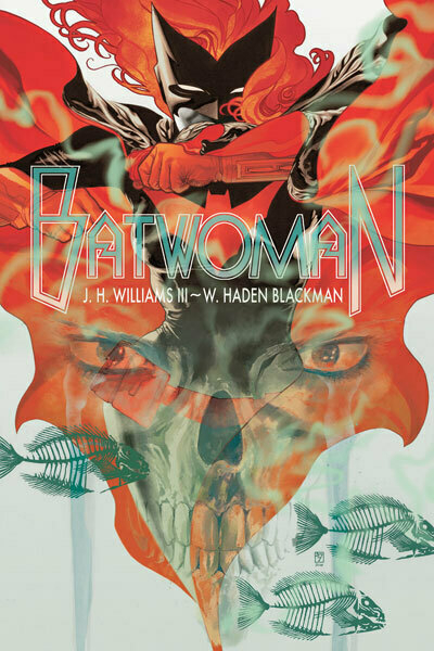
Batwoman #1 Written by JH Williams III & W. Haden Blackman, Art by JH Williams III
Pros: Wow, what an awesome book! I had heard that Batwoman had been quite a read, but I didn’t know if I expected this! Absolutely stunning art, mixed with a storyline that is equal parts supernatural and neo-noir, I was hooked by every page!  Kathy Kane definitely feels like a new generational hero, and her unique nature makes her stand out amongst the rest of the DCU.  I am sold on this one.  Plus, for the longtime fans, adding a new sidekick to the mix must be a nice progression for the hero.
Cons: Not too many. I can say that having the group tracking down an openly gay female hero called “The Lipstick Project” was a little too on the nose, but I don’t know if that was intentional - did the group exist before? Â Oh, and why does Batman get shoehorned into ANOTHER book?
Would I Continue Reading It?: Yes please. And now I want to get the first few trades to see what I missed! (This is one of the few books mostly unaffected by the relaunch)
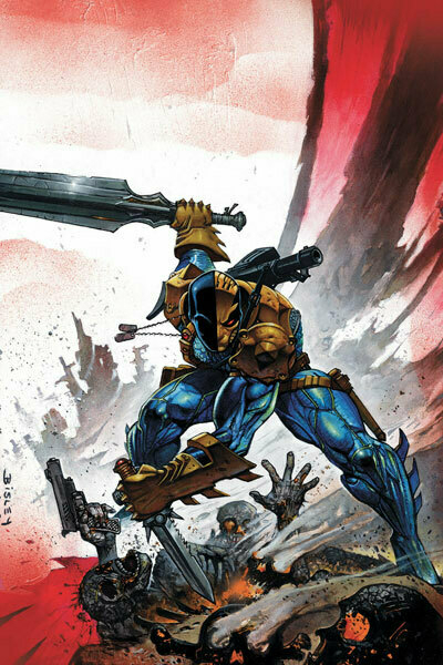
Deathstroke #1 Written by Kyle Higgins, Art by Joe Bennett
Pros: Deathstroke is a badass. And he’s a cranky old man. Soliders with modified Clayface DNA sounds cool. The art’s pretty competent too, and the book is a brisk read.
Cons: Oh my God, the dialogue is like the most ridiculous B-Movie ever. If that was the idea, well done, if not, HOLY CRAP IS THIS AN AWFUL COMIC. I mean, seriously, a team of sidekicks called “The Alpha Dawgs?” Â And I really hate the “suitcase that everyone sees but the audience” trope. Blargh.
Would I Continue Reading It?: Oh, there’s going to be a second issue? Wouldn’t have gathered that from this one. I guess I can applaud the writers for wrapping everything up in 22 pages, but there really isn’t much that has me on board for more. Pass.
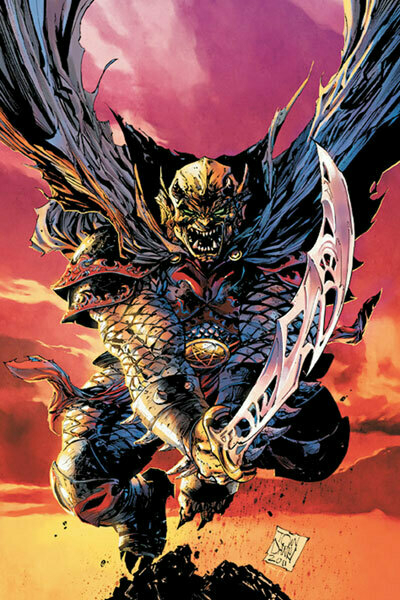
Demon Knights #1 Written by Paul Cornell, Art by Diogenes Neves
Pros: Wow, what a goofy and fun book! You guys want a read that is decidedly NOT connected to the rest of the DCU? How about a romp through the dark ages with the Demon Etrigan! Â I didn’t realize Etrigan had been such a fun character until now, but he’s an absolute hoot! Â The book itself, given that it’s a medieval-era team comic has a basic setup getting our cast of characters in a room together, but ends up being a fun read. Â And the last page? FREAKIN' DRAGONS!
Cons: There aren’t too many, but if you’re expecting the capes and boots DCU, you’re gonna be barking up the wrong tree here.
Would I Continue Reading It?: Yes please! Bring on more wacky medieval goodness!
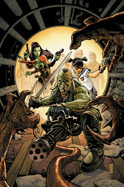
Frankenstein, Agent of S.H.A.D.E. #1 Written by Jeff Lemire, Art by Alberto Ponticelli
Pros: Frankenstein! Werewolves! Mummies! Vampires! Giant Monsters! An old man in the body of a little asian schoolgirl! Frankenstein’s 4 armed dragon lady wife! EVEN MORE GIANT MONSTERS! AND STUFF BLOWS UP! This is a total ridiculous sugar high of a book. I should have known I’d like it, as it’s written by the dude behind the amazing Vertigo book, Sweet Tooth.
Cons: The art is a tad messy, and I could see where some would argue that it’s a stupider, sillier version of B.P.R.D.
Would I Continue Reading It?: Hell and yes. Lemire has me for this one, for sure.
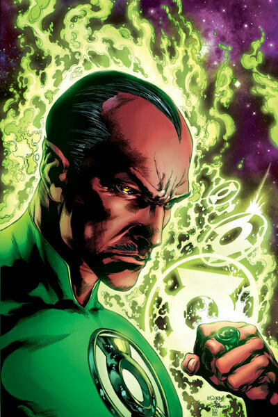
Green Lantern #1 Written by Geoff Johns, Art by Doug Mahnke
Pros: Having Sinestro back as a GL proper is a very interesting setup, especially seeing him in the mix with the Guardians (who do not trust him) and the Sinestro Corps, who now find themselves against him. Â It’s well juxtaposed against Hal Jordan, through whom we learn to answer to the question of “What would happen if a Superhero were forced to stop?”. Â Clearly it doesn’t work well. Â This is a fun read with solid art, and should be an enjoyable read for long-term, new and lapsed fans.
Cons: That said, unlike other books, the story here isn’t too little, it’s too much. The climax of the book probably would have been better paced into the third or fourth issue of the standard six issue run. Â To use a rude phrase, the load was blown a BIT early.
Would I Continue Reading It?: Halfway through the book, I’d say yes, but the last page tells me that we’re going to see the story either wrap up too early or drawn out too long. Boo to that.
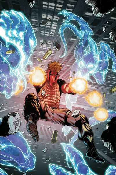
Grifter #1 Written by Nathan Edmondson, Art by CAFU
Pros: Holy 90’s flashback! The dude with the sweet mask from WildC.A.T.s is back as a regular member of the DCU! This book is basically if Sawyer from Lost fought something weird and supernatural.  The art is solid, if nothing more than inoffensive, and there are some really dynamic moments.
Cons: Can anyone really tell me what happened in this comic? It’s a terrible example of many hints being dropped of a plot, but NONE being picked up.  The book wants so badly to be exciting and mysterious, but seems to fail on both, by delivering nothing over it’s 22 pages.
Would I Continue Reading It?: No. No thank you at all.
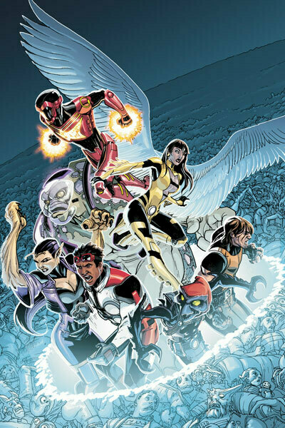
Legion Lost #1 Written by Fabian Nicieza, Art by Pete Woods
Pros: This is the textbook definition of an inoffensive comic book. Decent writing, decent art, enough story to get you to flip through the pages. Â Nothing really terribly awful, nothing anger inducing.
Cons: But there’s nothing to be passionate about here. I believe this is the continuation of the long running Legion of Superheroes, but there isn’t really much connecting this book to the old, minus the time travel, and the whole ‘wacky people from the future in the present day!’ thing. I know, fresh slate, but context would be nice. Honestly, I read this thing twice, and I couldn’t tell you a single thing that hooked me. Â It’s completely disposable. Â And when you’re in a slate of 52 books, being forgettable isn’t a good thing.
Would I Continue Reading It?: I read it? Â Oh, oh yeah, I did. No mas, por favor.
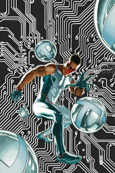
Mister Terrific #1 Written by Eric Wallace, Art by Gianluca Gugliotta
Pros: On paper, Mister Terrific is a very interesting character, a super smart, super rich superhero who becomes a hero not just to better himself after a dark period, but to also better all of mankind.  Also, the prime setup of a character who is working hard to create a future that he knows must exist, but does not know how it comes to be is certainly a different way of mixing time travel into a comic series.  It’s a world I could see explored well moving forward.
Cons: It’s a shame that this book doesn’t live up to the setup. Â The plot is mostly disengaging, and oh my god, the art is UGLY. No wonder the creative team for the first three issues keeps changing.
Would I Continue Reading It?: Â Sounds like this is a half cooked book that was let out when it shouldn’t have been. Avoid.
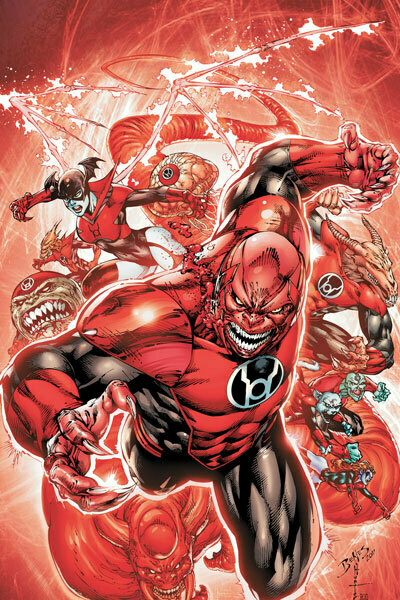
Red Lanterns #1 Written by Peter Milligan, Art by Ed Benes
Pros: I have to say, the idea of giving the Red Lanterns their own book sounds like pure fanservice (given the book starts with the kitty Dex-Starr wrecking aliens), but by the end, I was sold on the idea of them becoming heroes of sorts turning their rage into a vengeful justice on those who cause chaos across the universe. Â The art was mostly solid (felt very early Image-esq), and the writing was decent enough (that opening Dex-Starr bit caused me to chuckle).
Cons: This almost feels like the Venom-izing of the Red Lanterns. Â Just because a character (or characters, in this case) are beloved, that doesn’t mean that we need to make them heroes to justify them to the audience. Â I guess I’m worried of the concept losing gas 12 issues in, and then it looks like a failure.
Would I Continue Reading It?: I can’t say that I would find myself reading this book regularly, but I certainly feel that if you loved the Red Lanterns, this book would be more of what you like about them. Â The Green Lantern universe was left mostly untouched with the New 52 relaunch, and this book continues to give you more of the same, for better and for worse.
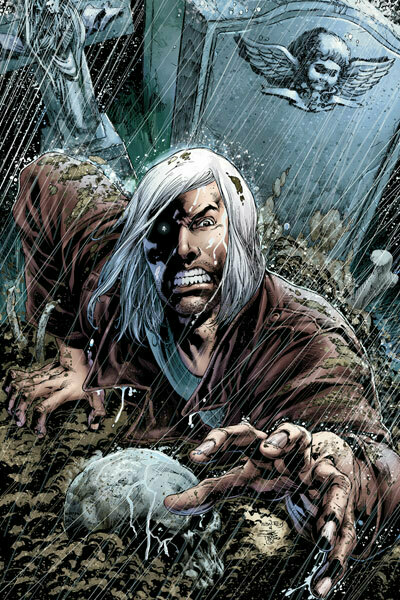
Resurrection Man #1 Written by Dan Abnett & Andy Lanning, Art by Fernando Dagnino
Pros: Of all the series going for the “make it like the first episode of a TV show!” approach, Resurrection Man is the one that actually makes it work. You have a superhero with VERY unique powers (that are demonstrated well), some intrigue, some mystery, and a plot that is exciting throughout. Not to mention the art is very solid. Good use of shadow and lighting to give the whole book a foreboding feel.
Cons: Some of the mysteries are a little too “hey, here’s a character! Wanna know them? BUY ISSUE TWO!”, but I suppose they have to tease us somewhere.
Would I Continue Reading It?: Provided the rest of the issues follow this pace, I could see myself becoming a trade reader for this one. Well done, Abnett, Lanning and Dagnino!
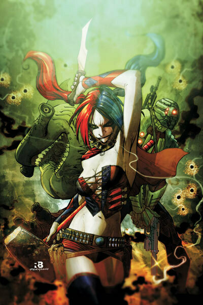
Suicide Squad #1 Written by Adam Glass, Art by Marco Rudy
Pros: Uh..
Cons: This sucks, holy shit this sucks. This is a comic written by people who think violence and things that are TOTALLY XTREME rule hard. Harley Quinn’s new costume sucks, the dialogue is awful, Amanda Waller is skinny for some reason, and the entire story is a cop-out to setup for an even dumber story next month. Everything involved deserves better.
Would I Continue Reading It?: No. No, no, no, no, no. No.
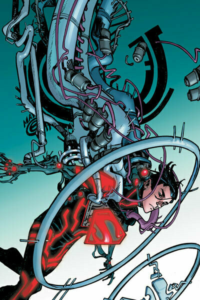
Superboy #1 Written by Scott Lobdell, Art by RB Silva
Pros: For a book I expected to hate, Superboy had me intrigued from the word go.  I mean, not every superhero book is built around a super intelligent test tube baby.  There are a number of surprise twists through the book, starting with the cameo of an old favorite from the Wildstorm Universe, in a VERY different role. The art is great, and has a nice manga feel to it, and always stays grounded while giving the eyes something to enjoy.
Cons: Given the last few pages of this book, I can’t help but wonder if having both this and Teen Titans won’t result in some overlap between the two comics, but I guess that can be resolved with some split narrative.  And much like Green Lantern, it’d be nice if some of the twists arrived a few issues in, as opposed to half way through the book.
Would I Continue Reading It?: Depending on how this and Teen Titans turn out, Superboy could end up being great, or just a book with a first great issue. Time will tell, it could really go either way.
Welp, that wraps up Week Three! Â Quite the journey we had here. As always, I’d love to hear your thoughts in the comments.
Here’s what is coming up in Week Four…
Batman #1 Birds of Prey #1 Blue Beetle #1 Captain Atom #1 Catwoman #1 DC Universe Presents #1 Green Lantern Corps #1 Legion of Super-Heroes #1 Nightwing #1 Red Hood and the Outlaws #1 Supergirl #1 Wonder Woman #1It's a Bat Family heavy week, and we get to see how Wonder Woman is without pants again. Join us as we take the New 52 up to 39 total! Almost there...
Wednesday September 14, 2011
